Location, location, education: Part 3 – Brexit
29th March 2019 by Timo Hannay [link]
Having previously looked at poverty, urbanisation and immigration, we're now heading towards the conclusion of our investigation into social and educational trends across England. But given the publication of this third instalment on what was originally to have been 'B-Day', we couldn't help but take a brief detour to look at perhaps the most salient social and political divide of our time: Brexit.
A nation divided
Figure 1 plots the various factors we've be studying against the percentage of people voting for Brexit in the 2016 referendum. What, if anything, correlates with this?
Perhaps counterintuitively, measures of wellbeing, such as life satisfaction and anxiety, tend to be better in Brexit-supporting areas. Families in these areas are also more likely to get into their first choice or a top-three choice of school. On the other hand, outside London, poverty and socioeconomic segregation among schools are often higher. Furthermore, participation in higher education, the proportion of people with degrees and social mobility are all lower. Among schools, Pupil:teacher ratios are worse and self-generated income is lower.
Brexit-supporting areas are also more likely to show low performance at Early Years (up to age 5) and Key Stage 1 (age 7), at least outside London, as well in terms of secondary school attainment and progress. By age 16, most young people in Brexit-supporting areas are not any less likely to be in education or employment. However, by age 19, students are less likely to have gained Level 2 (GCSE equivalent) or Level 3 (A-level equivalent) qualifications.
There is also an interesting relationship with changes to the ethnic composition of schools in the years leading up to the referendum. In London (though not in other regions), Brexit-supporting areas were more likely to have seen a large decrease in the white-British school population during 2011-2016. As we showed in our previous analysis of segregation in education, areas on the periphery of Greater London underwent large changes in ethnic mix during this time (shown in red on this map). Whether this is a cause-and-effect relationship is debatable, but it's certainly striking.
Take back control
Figure 2 provides an opportunity for you, dear reader, to play around with the data because it allows you to plot any metric against any other. For example plotting ethnic segregation among schools on the y-axis against proportion of white British pupils on the x-axis shows an interesting pattern with the highest levels of segregation in the middle of the graph. This is perhaps unsurprising since mixed populations have the greatest potential scope for segregation. But note that even in this middle group there is a wide range of segregation levels: most areas in London and the Midlands tend to show less segregation than those in other areas of the country with similarly mixed populations.
Another interesting metric to study is grant funding per pupil. The trends here are predominantly driven by London, which spends much more than other regions (in what is, admittedly, an expensive city in which to operate). For example, Key Stage 2 attainment shows a positive correlation, especially for disadvantaged pupils. But the relationship with secondary-school progress is much less convincing and for GCSE attainment it seems to be absent altogether.
There are literally thousands of other combinations for you to try, though we can't promise that all of them will make sense. To paraphrase Spider-Man's Uncle Ben, with great power comes a great opportunity to waste all your time on fruitless activities – just ask any Member of Parliament.
To provide a map of this vast landscape, Figure 3 shows a correlation matrix for all the indicators we've been studying. Larger dots and more intense colours indicate a stronger correlation, with blue for positive relationships and red for negative ones. Hovering over the points will display the corresponding indicators and their correlation coefficient; clicking on them will display the relevant data sets in Figure 2.
The blue diagonal line is simply a consequence of the fact that each parameter correlates perfectly with itself. The mainly blue area to the bottom-right contains various educational indicators, which tend to correlate positively with each other, but elsewhere the picture is much more varied. The strongest negative correlations of all are between EAL status (ie, pupils with English as as an additional language) and white British ethnicity, as well as our old friend, Brexit support and people with degrees.
And another thing
Update added 12/4/19: Following a reader suggestion, we have added Figure 4, which provides the same information as in Figure 3, but makes it easier to investigate correlations for a single indicator of interest. Selecting an indicator from the menu will display its correlation coefficients for all other indicators, ordered from strongest positive correlation to strongest negative correlation, with uncorrelated indicators in between. Hover over the columns to see full descriptions and exact correlation coefficients.
The next instalment will be the last in this series. We will use it to ask – and perhaps even answer – the question, 'What does all this mean for the way in which we should think about education across England?'. Until then, we welcome your thoughts: [email protected].
Footnotes:
Acknowledgements:
Thank you to Mark Boylen for asking about correlations between attainment and spend per pupil, to Pete Ure for suggesting we add a correlation matrix and to John Ensley for creating the open-source code on which our matrix is based.
Location, location, education: Part 2 – Urbanisation
22nd March 2019 by Timo Hannay [link]
Our previous post looked at educational and societal measures that correlate with poverty. This one will examine two more characteristics that help to define our country: urbanisation and immigration. As we shall see, some urban areas overcome inauspicious circumstances to do well on a variety of educational and social measures. But not all of them do so, and at least part of the difference appears to be connected with the presence or absence of ethnic minority communities. To find out more, read on.
In a city
The idea of an English pastoral idyll is so firmly embedded in the national psyche that one could be forgiven for assuming that our country is largely rural. But such a belief would be wrong – at least if we're talking not about land but about people.
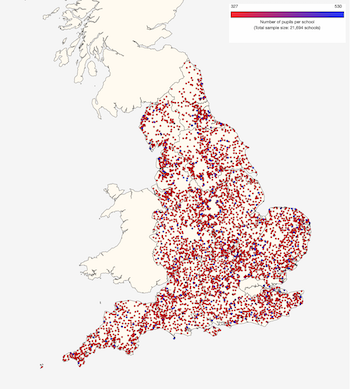
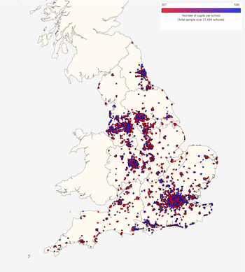
To see how impressions can mislead, look at Map 1 (below left), which shows the locations of all mainstream state schools located in rural areas (as defined by the ONS Rural-Urban Classification). Map 2 (below right) shows those in urban locations. If you had to guess, you might say that the numbers of pupils in each of these groups is roughly the same, or even that the rural group is bigger. In fact, only 14% of pupils attend schools in the left-hand map; fully 86% go to those in the right-hand map. This confusion arises from two main sources. The first is that there are far fewer schools (26%) in the left-hand map than in the right-hand one (74%). The latter look less numerous because at this resolution many of them appear on top of each other. In addition, rural schools are almost always small (red dots) while urban school are often large (blue dots), so the distribution of pupils is even more skewed.
(Click on these maps or any of the others that follow to go to larger interactive versions.)
To explore the effects of urbanisation a bit deeper, Figure 1 shows the same set of social and educational factors we saw in our last post1, but this time plotted against degree of urbanisation2 for each area. On this measure, local authorities tend to cluster, with a highly urbanised group on the right (corresponding to the ONS 'major conurbation' category), a semi-urban group in the middle (corresponding to the ONS 'city and town' category) and a collection of more rural areas on the left. As we have seen, schools and pupils are much more likely to be located built-up areas, so even the most rural local authorities have urbanisation measures of over 50%.
Urban areas are more likely than rural areas to have high rates of child poverty and large proportions of pupils eligible for free school meals – though there are plenty of poor semi-urban areas too. They are also more likely to have large ethnic-minority populations and hence to have greater ethnic segregation in their schools. Social mobility in urban areas is generally higher, especially in London, but so is anxiety, and life satisfaction is typically lower.
Urban pupils are much more likely to have English as an additional language (something we will look at in more detail below) and less likely to end up at their first-choice or top-three-choice school (though this could be simply because rural communities have little choice to begin with). Parental engagement (as judged by response rates to Ofsted's Parent View survey) tends to be lower. Teachers are less likely to work part-time or to be over 50. Although there is no systematic difference in cognitive abilities at Early Years (up to age 5) or Key Stage 1 (up to age 7), academic performance at the end of Key Stage 2 (age 11) is, if anything, slightly better in urban areas – though this trend is less convincing outside London. Disadvantaged pupils in urban areas do noticeably better at the end of Key Stage 2, with relatively high levels of progress between the ages of 7 and 11 in reading, writing and maths. Indeed, this is also true for non-disadvantaged pupils, with a particularly noticeable trend in maths progress among all pupils. However, by the time they take their GCSEs at age 16, urban pupils seem little better off than their suburban and rural peers, especially outside London.
Use the menu above Figure 1 to explore the relationship between urbanisation and a range of other metrics. You can also click on the legend to turn individual regions on or off.
Language barrier?
Next we will look at pupils with English is an additional language (EAL). As we saw in Figure 1, this partially correlates with urbanisation, but it's an asymmetric relationship: areas with high proportions of EAL pupils are typically urban, but not all urban areas have lots of of EAL pupils. That's why it's worthwhile analysing these attributes separately.
First, though, a word about the relationship between EAL and ethnicity. Map 3 (below left) is a cartogram in which each local authority area has been sized according to the number of pupils at school there. (This makes small, densely populated urban areas easier to see.) The blue shading indicates the proportions of EAL pupils in each local authority. As you can see, they tend to be concentrated in metropolitan areas, especially London. Map 4 (below right) shows the proportions of pupils who identify as members of an ethnic minority (ie, something other than white British). Though they are not quite identical, these two maps are very similar, suggesting – perhaps unsurprisingly – that EAL is a good proxy for ethnic minority status. (Once again, click on these maps to go to larger interactive versions.)


Figure 2 shows the same data as Figure 1, but this time plotted against the proportion of pupils for whom English is an additional language (EAL). As you can see, local authority areas with high proportions of EAL pupils (to the right of the chart) are mostly in London (represented by purple dots), so what follows is largely a story about how schools in London differ from those elsewhere in the country. As we saw in Maps 3 and 4, these areas have low proportions of white British pupils – and the correlation is very strong, at least at the local authority level. They also show high levels of social mobility and participation in higher education, but lower levels of support for Brexit. Though it's possible to interpret these results in a variety of ways, they more or less align with the stereotype of EAL as an indicator of worldly, upwardly mobile immigrant families. Not all is rosy, however: these same areas often show raised levels of anxiety among the general population and of special educational needs certification among schoolchildren.
While response rates to Ofsted's Parent View survey are often lower in areas with a high prevalence of EAL (presumably at least in part because of linguistic barriers), so are levels of pupil absence and persistent absence. The main differences among teachers are that they are less likely to work part-time or take sickness leave, and they earn higher average salaries. Pupil:teacher ratios also tend to be more favourable.
Perhaps contrary to expectations, EAL children do not show lower levels of performance at age 5 or age 7, and by age 11 they move ahead, especially among disadvantaged pupils. Reading levels are little better than elsewhere, but attainment in maths and GPS (grammar, punctuation and spelling) are considerably higher. Progress in maths is particularly impressive both for disadvantaged pupils and for all pupils taken together. Progress up to GCSEs is also higher in areas with more EAL pupils. By age 19, students in high-EAL areas are more likely to have attainment Level 3 qualifications (A-levels or equivalent). Thus, somewhat counterintuitively, children with EAL seem to start off no worse than their monolingual peers and go on to make greater progress during both primary and secondary school.
Once again, use the menu provided to view these and other metrics; click on the legend to turn regions on or off.
City or ethnicity?
Taken together, these analyses show that urban areas can overcome unpromising social indicators such as high poverty and low life satisfaction to achieve good results at primary school. But this is often not sustained into secondary school. There are echoes here of our previous analysis on poverty, which showed the deprivation attainment gap closing during primary school only to open up again by the time pupils sit their GCSEs. In this case, however, there's an exception: urban areas with large ethnic minority populations tend to sustain this early success into secondary education and beyond. That's why, contrary to common perception, EAL is seen among education experts as a positive indicator of future outcomes.
Why this should be so is a topic of much debate. Anecdotally, many ethnic minority groups have a reputation for taking education very seriously and hence for doing better at school than might otherwise be expected given their relatively low levels of affluence and influence. The results presented here tend to support that view. But a complicating factor is the influence of London, which has long outperformed other parts of the country on a wide range educational measures. Do EAL pupils perform well because many of them live in London, or does London overachieve because it has so many EAL pupils? A bit of both perhaps, but either way, the combination seems to be a potent one.
Footnotes:
Location, location, education: Part 1 – Poverty
15th March 2019 by Timo Hannay [link]
If, as US congressman Tip O'Neill famously claimed, all politics is local then what of education? How much does location affect the type and quality of a child's schooling, and how does this relate to social factors such as wealth, ethnicity and urbanisation? This is the first in a series of posts that aims to provide an overview of demographic, socioeconomic and educational indicators1 by English local authority area2. It reveals (we think) some very interesting patterns across the country.
In this post we will look at arguably the single biggest fault line running through our society and education system: poverty. Among other things, we show that the attainment gap between poorer and more affluent areas closes during primary school, but opens up again during secondary school and returns with a vengeance by the time pupils sit their GCSEs. But there's much more to say, so read on.
Poverty lines
Figure 1 shows various social and educational factors (vertical axis) against local child-deprivation rates (horizontal axis). Each dot represents a local authority, sized according to the number of pupils and colour-coded based on its region. The poverty metric we have used, 'Income Deprivation Affecting Children Index' (IDACI), is a government measure of the proportion of children – at school age or below – living in poverty. Points on the left represent affluent areas and those on the right poorer areas. (Hover over the dots to see accompanying data; click on the figure legend to turn individual regions on or off.)
In general, poorer areas report lower life satisfaction. Outside London (a frequent exception to the trends we'll be examining), poorer areas also have lower house price ratios3, lower social mobility4 and greater socioeconomic segregation among schools5; local populations are less likely to participate in higher education or hold a degree, and are more likely to show high levels of support for Brexit. Poorer areas generally have higher school funding per pupil6 (especially in London), though self-generated income7 tends to be lower (especially outside London).
Pupils in poorer areas outside London are more likely to be absent or persistently absent. Across the country, they are also more likely to be receiving special educational needs (SEN) support – though, if anything, a bit less likely to have an official 'SEN statement' or 'EHC plan', at least outside London. Teachers in poorer areas less likely to work part-time and less likely to be over 50. Outside London, teacher salaries are no higher than in more affluent areas, though in London there does seem to be a correlation between local poverty and teacher pay.
Response rates to Ofsted's Parent View survey are much lower in poorer areas, possibly reflecting reduced parental engagement. Early-years cognitive development (up to the age of 5) also tends to be lower and this trend continues to the end of Key Stage 1 (age 7). More surprisingly, there is little or no correlation between poverty and performance by the time pupils reach the end of Key Stage 2 (age 11), a point emphasised by the fact that poorer areas actually show higher progress among disadvantaged pupils in reading, writing and maths (and among all pupils in writing and maths). The one exception is reading, where a gap between poorer and more affluent areas continues to persist at age 11, especially outside London.
Unfortunately this closing of the attainment gap between poorer and more affluent areas does not extend through secondary school. Here, pupils in poorer areas show less academic progress, especially outside London, and lower eventual GCSE results. At age 16 they are less likely to go into education or employment. Outside London, 19-year-olds are less likely to have gained Level 2 (GCSE equivalent) or Level 3 (A-level equivalent) qualifications.
There are many other interesting patterns to uncover. Use the menu above Figure 1 to explore the relationship between local poverty and a range of other metrics.
Dissecting disadvantage
There's a lot here to unpack. Perhaps most striking is the fact that the attainment gap between poorer and more affluent areas closes during Key Stage 2 (ages 7-11), but opens up again by the end of Key Stage 4 (age 16). This is consistent with our previous analysis of the north-south divide (which is driven in part by differing levels of poverty). In particular, there is a stark national pattern at GCSE that isn't present at age 11. In our view, this is a greatly underappreciated aspect of England's education system.
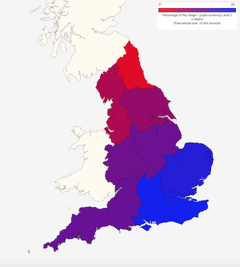
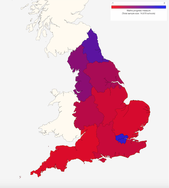
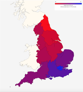
We can also see this in the following maps. Map 1 (below left) shows levels of maths attainment at age 78. This displays a very clear north-south gradient (reading and writing show similar patterns). Map 2 (below right) shows overall attainment at the end of Key Stage 2. Here, London and the North East – incidentally, the regions with the highest levels of poverty – come top and there is no obvious north-south gradient.
(Click on these maps or any of those that follow to go to larger interactive versions.)
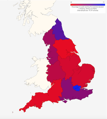
Consistent with this, London and the North East show the highest levels of progress during Key Stage 2, as shown in Map 3 (below left) for maths. (Reading and writing show similar patterns.) By the time pupils take their GCSEs, however, the north-south divide returns, as shown in Map 4 (below right).
It's not clear, at least from these data alone, what causes such big differences in schools' ability to close the deprivation attainment gap during Key Stage 2 versus Key Stage 4, so we can only speculate. One reason might be that the basic numeracy and literacy skills taught at primary school are easier to teach, even to pupils who start at lower levels of attainment. (It's interesting to note that reading is the one area where poverty-related differences persist. It is also the subject perhaps most likely to be practised regularly at home by less disadvantaged pupils.) In contrast, it may be more challenging to bring everyone up to the same standard on the relatively sophisticated concepts taught at secondary school. Here, having parents or other family members who have also studied these subjects may be more beneficial to students. In addition, the ages and attitudes of pupils could be playing a role. For example, disadvantaged primary school children might be more receptive to the idea of catching up with their peers than secondary school adolescents, who are often forming their own opinions about the value or otherwise of education and seeking to express autonomy.
Another fascinating trend concerns SEN pupils. As we saw, informal SEN support is more prevalent in poorer areas, but official SEN certification is, if anything, less common. An optimistic interpretation is that poorer local authority areas are effective in preempting SEN certification by providing greater support at earlier stages of need. A more cynical view is that the prevalence of SEN tends to be higher in poorer areas, but the ability of families to negotiate the bureaucratic hurdles required for certification is lower. Choosing between these perspectives is left as an exercise for the reader. :)
That's it for now on the subject of poverty. Next time we'll look at two other defining characteristics of English society: urbanisation and immigration. Until then, we welcome your feedback: [email protected].
Footnotes:
Sources:
About
This is the SchoolDash blog, where we write about some of our projects and other things that spark our interest.
Blue links take you to other parts of the page, or to other web pages. Red links control the figures to show you what we're talking about.
Archives
- June 2026
- May 2026
- April 2026
- December 2025
- November 2025
- October 2025
- September 2025
- August 2025
- July 2025
- June 2025
- April 2025
- November 2024
- October 2024
- June 2024
- April 2024
- March 2024
- February 2024
- November 2023
- October 2023
- June 2023
- May 2023
- April 2023
- March 2023
- February 2023
- January 2023
- December 2022
- November 2022
- October 2022
- September 2022
- August 2022
- June 2022
- April 2022
- February 2022
- January 2022
- December 2021
- November 2021
- October 2021
- August 2021
- July 2021
- May 2021
- February 2021
- January 2021
- November 2020
- October 2020
- August 2020
- July 2020
- June 2020
- May 2020
- April 2020
- March 2020
- January 2020
- December 2019
- November 2019
- August 2019
- July 2019
- April 2019
- March 2019
- January 2019
- November 2018
- October 2018
- August 2018
- July 2018
- April 2018
- January 2018
- November 2017
- October 2017
- July 2017
- June 2017
- May 2017
- March 2017
- December 2016
- October 2016
- September 2016
- August 2016
- July 2016
- June 2016
- May 2016
- April 2016
- March 2016
- January 2016
- December 2015
- November 2015
- October 2015
- September 2015
| Copyright © 2026 |