Brand new maps, same old story
30th April 2018 by Timo Hannay [link]
Interactive maps are one of SchoolDash's original features. Soon after our launch in late 2015 we looked at them in some detail through a series of blog posts (and associated press articles). These described clear north-south differences in secondary school performance (amidst more complex local patterns), but also a rather different picture among primary schools in which certain northern regions – notably the North East – performed rather well compared to other parts of the country.
Now fast-forward to 2018. Last month we quietly updated our Maps application to include a wider range of the DfE's latest measures, and to retire a few others that had passed their best-before dates. This post takes a look at some of these more recent indicators in order to see how they compare them with the picture we saw a couple of years ago. The most recent data show results from 2017, and we'll focus on Key Stage 2 (up to age 11) and Key Stage 4 (up to age 16).
Key Stage 2: Poverty is no barrier
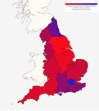
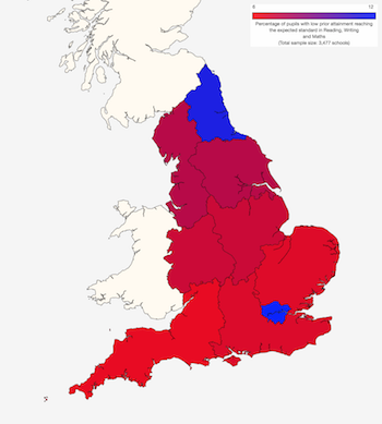
At age 11, there are clear regional disparities with London schools showing an average of 68% of pupils at or above the expected standard in Reading, Writing and Maths, while the same figure for Yorkshire and The Humber is almost 10 percentage points lower (see Map 1, below left). Interestingly, the North East and the South East also do well. Since London and the North East have the highest proportions of poor pupils, while the South East has the lowest, this suggests little correlation with poverty, at least at the regional level.
At the finer-grained constituency level (see Map 2, below right), we see clear subregional patterns too. London still does well, but the South East shows a disparity between inland areas (better) and coastal areas (worse), the far South West reveals its own local north-south divide, and there are specific areas of underperformance such as Norfolk and Cambridgeshire, Walsall and Leeds.
(Click on any of the maps below to go to larger interactive versions. Unless otherwise stated, red indicates low values and blue indicates high values.)
Maps 1 and 2: Percentage of KS2 pupils reaching the expected standard in Reading, Writing and Maths (2017)
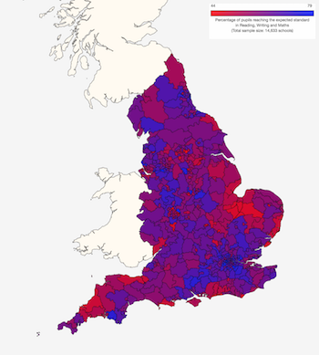
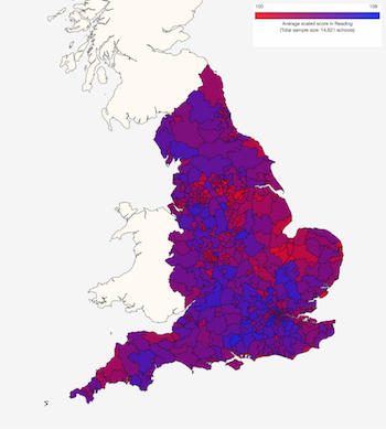
The separate patterns for performance in Reading (Map 3, below left) and Maths (Map 4, below right) are very similar, suggesting relatively little difference between subjects, at least at this stage of education.
Maps 3 and 4: Percentages of KS2 pupils reaching the expected standard in Reading and Maths (2017)

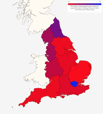
Notice, too, just how well London and the North East do in getting disadvantaged (mostly poor) and previously low-attaining pupils to reach expected attainment levels by age 11 (Map 5 and Map 6, below). On the latter measure in particular, they're streets ahead of the rest of the country1.
Maps 5 and 6: Percentages of disadvantaged and previously low-attaining KS2 pupils reaching the expected standard in Reading, Writing and Maths (2017)
Key Stage 4: A country of two halves
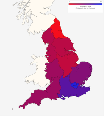
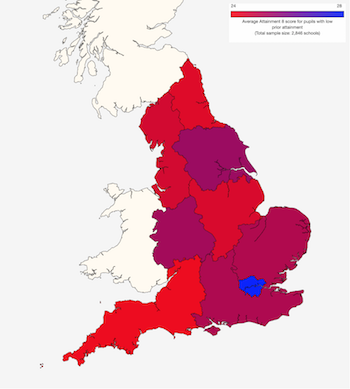
At age 16, we see London maintain its lead but the North East falls behind considerably. Indeed, based on the new Attainment 8 score (Map 7, below left), it is the lowest-ranked region in the country. Partly as a result of this, a clear north-south disparity emerges. Note that there's little difference between this and the traditional '5 good GCSEs' measure (Map 8, below right) – though there are certainly reasons to prefer the newer measure anyway2.
Maps 7 and 8: Mean Attainment 8 score and percentage of pupils achieving 5 good GCSEs (2017)

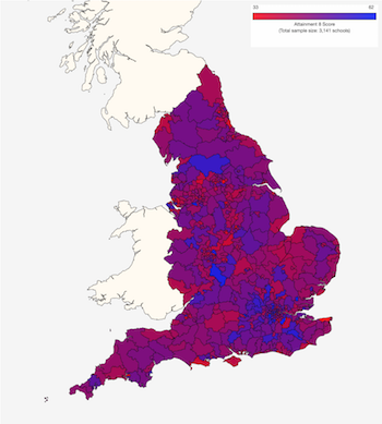
The Attainment 8 constituency map Map 9, below left) shows a more nuanced local view. The Progress 8 measure (Map 10, below right), which looks at the progress each pupil makes between 11 and 16 rather than their absolute attainment level at age 16, shows a very similar pattern. This suggests that much of the geographical difference in performance at age 16 is caused by differences in pupils' progress at secondary school rather than their prior attainment levels at primary school.
Maps 9 and 10: Mean Attainment 8 score and percentage of pupils achieving 5 good GCSEs (2017)

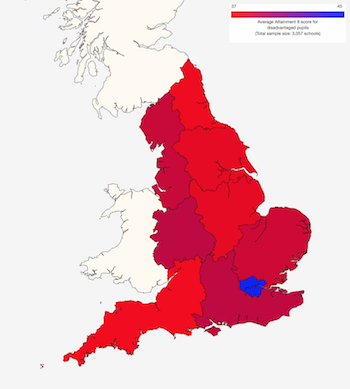
At Key Stage 4, London reigns supreme in the attainment levels of disadvantaged and previously low-attaining pupils (Map 11 and Map 12, below). As we've described previously, London's stunning educational success is in part a result of reducing the effects of poverty on attainment. The reasons for this are the subject of much debate in education policy circles and they are surely manifold. But it is striking that this effect seems to apply mainly to secondary schools, not primary schools, suggesting that socioeconomic and demographic factors alone are unlikely to provide a full explanation.
Maps 11 and 12: Mean Attainment 8 scores of disadvantaged and previously low-attaining pupils (2017)
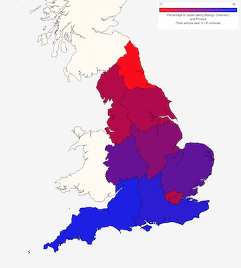
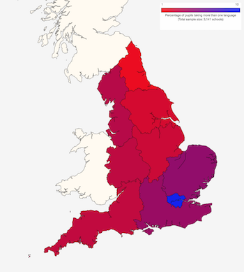
Subject choices display interesting patterns too. Outside London, the south of England shows a relative preference for the sciences (Map 13, below left). Note how similar this is to the distribution of poor pupils3. The implication seems clear: children in poorer areas are less likely to study individual science subjects. In contrast, pupils in London are much more likely than those elsewhere to take more than one language (Map 14, below right). This is perhaps unsurprising given the very high proportion of pupils in London who already speak languages other than English.
Maps 13 and 14: Percentages of KS4 pupils taking Biology, Chemistry and Physics, or taking more than one language (2017)
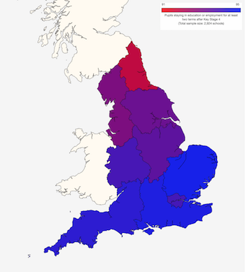
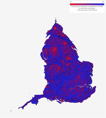
There is also a clear north-south gradient in the proportions of students staying in education or employment after the age of 16 (Map 15, below left). This is caused in part by some specific areas in the north showing particularly low levels. Map 16 (below right) shows this in the form of a cartogram, where each area is scaled according to its pupil population.
Maps 15 and 16: Percentage of pupils staying in education or employment after Key Stage 4 (2017)
Key point: Plus ça change
So there we have it: England continues to be a country in which your chances of doing well at school vary a great deal depending on where you live. But the patterns in primary and secondary education are rather different, suggesting that these disparities may not all be caused by underlying social factors such as poverty and ethnicity. Yet for all the new measures now available to us, and for all the time that has passed since 2010, when England's education data started to became openly available, this overall picture has changed depressingly little.
Footnotes: