Segregation in education
22nd March 2017 by Timo Hannay [link]
The aims of education
Amid the constant talk of parental choice and exam league tables, it's easy to lose sight of the fact that education isn't just about finding a pleasant school and enabling children to achieve good grades (important though both of those things are), it also plays a wider social role. For most of us, school was the first place where we came across people who were not merely older than us but different in other ways, like ethnicity, religion or affluence. Such experiences are as important in understanding the richness and complexity of the world as lessons in science or history. Schools are not just for producing new workers and thinkers, but also new members of society.
In which case, how are they doing? Over the last few months SchoolDash has had the privilege of working with The Challenge and the iCoCo Foundation, both acknowledged thought-leaders on this topic, to investigate the current state of ethnic and socioeconomic integration or segregation in England's schools. The results are published today in our joint report, Understanding School Segregation in England. For a review of the existing literature, the main findings from our analysis and our recommendations, please read the report. This post is intended to act as a complement by providing access to more of the underlying data and allowing you to explore it for yourself.
We have previously investigated the topic of socioeconomic segregation in some detail. Suffice to say for now that our previous analysis described substantial socioeconomic segregation in England's schools, and a situation in which poorer children are at a distinct disadvantage. This is not just a result of house-price effects and academic selection at grammar schools (both of which are widely discussed), but also of selection bias across a wide range of popular school types, including Ofsted 'Outstanding' schools, certain groups of faith schools and some kinds of academies. These latter effects are largely overlooked even by strong proponents of equality in education.
To begin with we will turn our attention instead to patterns of ethnic segregation. In order to investigate this, we used data from the DfE's annual school census between 2011 and 20161. A total of 18 different ethnic classes are recorded2, but for the purposes of this analysis we have reduced these to two: White British (the majority in most areas) and everyone else. This is admittedly a big simplification, but has the benefit of analytical clarity and throws a spotlight onto the important relationships between the majority ethnic group and the rest.
Cities and ethnicities
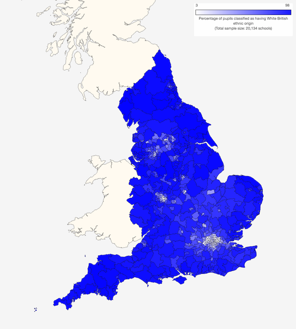
Most schools in England cater predominantly for White British children, with notable exceptions in certain urban areas such as London, Birmingham, Leicester, Manchester and Bradford, as shown in Map 1.
Map 1: Proportions of White British pupils at state schools by Westminster parliamentary constituency (2016)
However, this visualisation is potentially misleading because those urban areas, while physically small, account for large proportions of the nation's school children. It is perhaps more informative to view the same information on a 'cartogram' in which each area (in this case, Westminster Parliamentary constituencies) has been resized according to the number of children going to school there. This is shown in Map 2.
Map 2: Proportions of White British pupils at state schools by Westminster parliamentary constituency (2016)

Map 2 shows that areas with high proportions of other ethnicities in fact account for a very large segment of the school population. (Click on either of the maps above to go to larger interactive versions; you can use these to view different geographical areas, school types and years.)
Furthermore, the proportions accounted for by other ethnicities are growing. The total number of school children aged between 4 and 16 in England's mainstream state schools rose from 6.51 million in 2011 to 6.84 million in 2016 (an increase of about 5%). Over the same period, the number of White British pupils fell from 4.87 million to 4.74 million. As a result, the proportion of White British pupils fell from just over 75% to 70%3. As shown in Figure 1, similar trends were seen in both primary and secondary schools, though the latter group continues to contain a higher proportion of White British pupils.
Figure 1: Proportion of White British children in English mainstream state schools (2011-16)
Very similar patterns are seen in every region, from the North East (which has the highest proportion of white English pupils) to London (which has by far the lowest). Most regions have White British pupil populations of around 80% (you can use the drop-down menu in Figure 1 to explore these – the vertical scale adjusts automatically to keep the lines for each region in view, but its range always corresponds to 20 percentage points). Despite this wide variation in baseline levels, all regions have seen broadly similar reductions in recent years.
A more detailed geographical breakdown of these changes is shown in Map 3. Increases in the proportions of White British pupils are shown in blue and large decreases in red. Most big decreases were seen in areas close to cities in which the proportions of White British pupils were already low (most notably the areas around London and Birmingham) as well as in certain other specific cities (such as Newcastle, Sheffield and Peterborough). But note that the centres of cities such as London and Birmingham did not themselves show large decreases in White British pupils. This is presumably in large part because the proportions there were already so low.
Map 3: Change in proportion of White British pupils by Westminster parliamentary constituency (2011-16)

A related effect is also evident in Figure 2 which shows changes in the proportion of White British pupils plotted against 2011 levels for each parliamentary constituency. The areas showing largest reductions were neither those that started with very high proportions of White British pupils (on the right of the graph) nor those that started with very few (on the left) but rather those with middling levels, often adjoining urban centres that were already home to high proportions of other ethnicities. The most extreme example is Dagenham and Rainham in east London, which saw a fall of 16 percentage points, from 54% White British pupils in 2011 to 38% in 2016. (Hover your mouse over the points to see constituency names and other details.) The same pattern can be seen for local authority (LA) areas too.
Figure 2: Change in proportion of White British children against starting proportion (2011-16)
Segregation by school
So much for these nationwide ethnic patterns, what about the levels of ethnic segregation at individual schools and within groups of schools? In order to investigate this, we need an unambiguous definition of segregation. Some previous studies have compared the ethnic mix of each school to that of the country as a whole, for example by defining 'segregated' schools as those in which more than 70% of pupils are from ethnic minorities. But this reflects mainly 'macro' residential segregation – something over which local authorities and the schools themselves don't have much control – and doesn't tell us much about the 'micro' perspective – ie, whether schools are in or out of balance with their local neighbourhoods. Moreover, it only identifies cases where White British pupils are under-represented and ignores cases in which they may be over-represented.
An alternative method is to to compare the ethnic mix of each school with that of its local neighbourhood as measured in the national census (our previous analysis of socioeconomic segregation used this approach). This has the benefit of providing a geographically detailed breakdown, but the ethnicity data include all residents, not just school children, and in areas where the ethnic mix is changing rapidly they may provide a picture that is out of date (the last census was in 2011).
We have chosen instead to compare the composition of each school with that of its 10 closest neighbours4. This has the benefit of enabling a direct and up-to-date comparison of the children in a school with those attending other schools nearby. In doing this, it is important to acknowledge that these nearby schools will not necessarily have overlapping catchment areas, or even be located in the same town or local authority area. It is also true that for some types of schools (eg, secondaries in rural areas), the average distances to these neighbouring schools will be much further than for others (eg, urban primary schools). Nevertheless, we believe that this is a reasonable and informative method by which to judge overall patterns of school segregation.
In addition to defining the method, we also need to establish a threshold that constitutes segregation. For this study, we have used the following criteria:
- A school is deemed 'segregated' if the proportion of White British pupils is more than 15 percentage points higher or lower than that in other nearby schools. For example, in an area where 50% of pupils are White British, any school with less that 35% would be deemed to have a 'Low' proportion and any schools with more than 65% would be deemed to have a 'High' proportion.
- The above criterion clearly does not identify segregated schools in any areas where the overall proportion of White British pupils is less than or equal to 15%, or greater than or equal to 85% (since White British pupils cannot comprise less than 0% or more than 100% of the school population). To allow for this, we also define as 'segregated' any school that has less than half or more than twice the proportion of either ethnic group compared to other nearby schools. For example, a school in which less than 10% of pupils are White British in an area where 20% have this ethnicity is deemed to have a 'Low' proportion. Conversely, a school in which less than 10% of pupils are non-white-British in an area where 20% have this ethnicity is deemed to have a 'High' proportion of White British pupils.
- In some cases (eg, small schools or ethnically homogenous local areas), these proportions may correspond to very small numbers of pupils, potentially creating to misleading statistical effects. For this reason, we do not classify any school as 'High' or 'Low' if the number of pupils by which it is out of balance with its local area is less than eight.
This collection of definitions may sound complicated, but as shown in Figure 3, the overall concept is relatively simple to understand. The vertical axis shows the percentage of White British pupils in each school and the horizontal axis shows the same percentage in the 10 closest schools. If each schools is broadly in balance with its local area then we would expect most of them to fall close to the diagonal, as indicated by the shaded area. (The two parallel sides correspond to the ±15 percentage point limit while the pointed ends correspond to the half/double limit.) Any schools appearing towards the top-left of the figure have higher proportions of White British pupils than other nearby schools while those towards the bottom-right have lower proportions. In fact, if we look at individual primary schools or secondary schools we see that many fall outside these bounds, sometimes by a large margin.
Figure 3: Proportion of White British children in each school against proportion in its locality (2016)
Differentiation and integration
The analysis that follows examines the locations and characteristics of these 'segregated' schools in order to distinguish between groups of schools that tend to contribute to greater segregation and those that seem to promote integration.
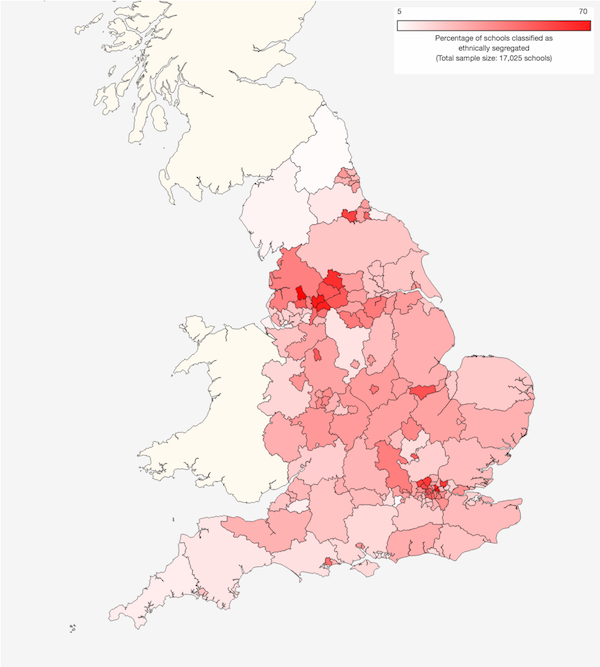
Map 4 shows proportions of ethnically segregated primary schools by local authority area. The highest levels are seen mostly in London the North West.
Map 4: Proportions of ethnically segregated schools by local authority area (2016)
Map 5 shows the same information for secondary schools. Overall levels of segregation are higher than for primary schools5. More specifically, we also see high levels of segregation in certain parts of Yorkshire and The Humber, the North East and the Midlands.
Map 5: Proportions of ethnically segregated secondary schools by local authority area (2016)
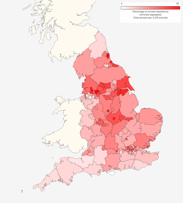
(Click on either of the maps above to go to larger interactive versions; these enable the data to be viewed by other geographical breakdowns and for earlier years6.)
As well as these geographical patterns, it is also informative to look at differences between school types. For example, Figure 4 shows a breakdown by Ofsted rating. Within each group, the percentage of schools with 'High' proportions of White British pupils is shown in red, while those with 'Low' proportions are shown in blue. The grey segments represent schools that are more or less in balance with their local areas. The column on the left represents all schools and thus provides a reference with which to compare each group. Among primary schools, there is little difference in overall segregation by Ofsted rating, though there is a slight trend for lower rated schools to be less white than their local areas. Among secondary schools, there is a much clearer trend, with lower rated schools generally showing higher levels of ethnic segregation. Whether this constitutes a cause-and-effect relationship, and if so which direction it follows, is unfortunately not possible to determine from these data. (Hover your mouse over the columns to view specific values. You can also click on the legend at the top of the figure to remove or add different segments.)
Figure 4: Ethnic balance of schools by Ofsted rating (2016)
Figure 5 shows a similar breakdown by religious denomination. Non-faith schools show slightly less segregation than faith schools, but the further breakdown of the latter group reveals much bigger differences. Church of England schools have similar levels of overall segregation to non-faith schools, though among primary schools they show a slight bias towards White British pupils. In contrast, Roman Catholic schools show higher levels of segregation and substantial bias towards non-White-British pupils at both primary and secondary. Perhaps unsurprisingly, the highest levels of ethnic segregation are seen in non-Christian faith schools (which include Jewish, Muslim, Hindu, Sikh and Buddhist establishments). Though their numbers are small, fully 84% of primary schools and 93% of secondary schools in this group show ethnic segregation relative to their local areas.
Figure 5: Ethnic balance of schools by religious denomination (2016)
Among secondary schools, we can also group schools by sex and academic selection. (There are virtually no single-sex or selective schools in the state primary sector.) This is shown in Figure 6. Overall, mixed-sex schools show less ethnic segregation than single-sex schools, with the latter group also displaying a bias towards non-White-British pupils. Despite overlapping to some degree with single-sex schools, grammar schools show substantially less ethnic segregation than secondary schools as a whole, though they do display a bias towards non-White-British pupils.
Figure 6: Ethnic balance of secondary schools by sex and academic selection (2016)
Finally, Figure 7 shows a breakdown by academy type. There is much less difference here, though it is notable that primary free schools seem to show slightly higher-than-average levels of segregation while secondary free schools display lower-than-average levels, and both show a bias towards non-White-British pupils. Since free schools currently constitute a relatively small proportion of all schools, especially in the primary sector, it is hard to know to what degree this is a real effect rather than a statistical artefact.
Figure 7: Ethnic balance of schools by academy classification (2016)
Ethnic segregation among these and other types of primary schools are summarised in Figure 8. In this diagram, groups with large proportions of 'High' White British schools appear towards the top while those with large proportions of 'Low' White British schools appear to the right. As a result, any groups with high overall levels of segregation will tend to be positioned towards the top-right while those with very low levels will be near the bottom-left. The large grey dot represents all schools and acts as a reference point. For example, we can use this to see the differences by Ofsted rating, religion and academy status already described above. (The size of each dot represents the number of pupils attending those schools. Click on the legend to turn individual groups on or off. Hover your mouse over each dot to see its name and accompanying data – including information about the average distance to the tenth closest school, which can vary substantially by school type.)
Figure 8: Summary of ethnic segregation by primary school type (2016)
In addition, we can use Figure 8 to see segregation patterns by level of deprivation. Schools with low levels of deprivation tend to show a bias towards White British pupils while those with medium or high levels of deprivation show the opposite trend, possibly because ethnic minority pupils are more likely to come from poorer families. The pattern for pupils with low prior attainment is very similar, which is unsurprising since this measure invariably correlates with poverty. The pattern for local poverty (based on census data for the area around the school rather than data about the pupils themselves) shows a slightly different pattern. In this case, schools located in poorer areas are no less likely to show a White British bias than other schools, but they are much more likely to show a non-White-British bias, increasing their overall level of segregation. In short, primary schools in poorer neighbourhoods are more likely to be segregated, and more likely to have disproportionately large numbers of non-White-British pupils, than those in more affluent neighbourhoods.
Smaller primary schools tend to show lower levels of segregation than larger ones, perhaps because they are also more likely to be located in rural areas, which contain fewer ethnic-minority pupils and thus provide less scope for segregation. This is consistent with the fact that rural schools also show lower overall levels of segregation than urban and suburban schools. Finally, the patterns by region show that the South West has the lowest overall level of segregation while London and Yorkshire & The Humber have the highest7.
Figure 9 shows the same analysis for secondary schools. Note that it is presented on a larger scale, corresponding to the higher levels of segregation seen. The patterns for school deprivation and proportions of pupils with low prior attainment are similar to those seen in primary schools, and also correspond closely with the differences by local deprivation. Among the regions, Yorkshire and The Humber, along with the East Midlands, show the highest overall levels of segregation, and the South West once again shows the lowest. Interestingly, among secondary schools, size seems to make no difference at all to ethnic segregation. (Once again, click on the legend to turn individual groups on or off; hover your mouse over each dot to see its name and accompanying data.)
Figure 9: Summary of ethnic segregation by secondary school type (2016)
For richer or poorer?
As well as looking at ethnic segregation, we also examined socioeconomic segregation by analysing the proportion of pupils at each school who are eligible for free school meals (FSM) and comparing this with the corresponding level in its local area. This builds on our previous study, which used 2011 census data to determine the level of child poverty in each neighbourhood. For the reasons mentioned above, and in order to make the socioeconomic analysis consistent with the ethnicity analysis, this study defined the level of child poverty around each school with reference to the proportion of FSM pupils at the 10 nearest schools4.
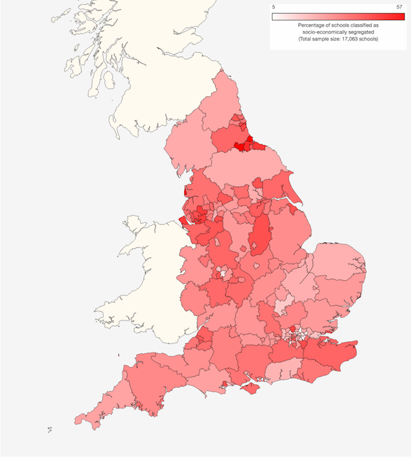
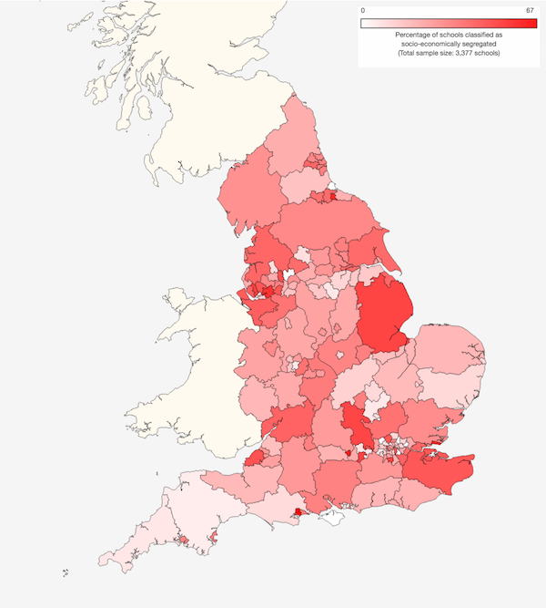
Map 6 shows the geographical patterns in socioeconomic segregation among primary schools by local authority area. One striking aspect of this is that it looks quite different to the pattern of ethnic segregation in Map 4. In this case, the highest levels tend to be seen in the North East and North West.
Map 6: Proportions of socioeconomically segregated primary schools by local authority area (2016)
The distribution of socioeconomic segregation among secondary schools, shown in Map 7, shares some similarities with that for primary schools, though with clear differences too.
Map 7: Proportions of socioeconomically segregated secondary schools by local authority area (2016)
The results for different types of primary school are summarised in Figure 10. Classifying schools by Ofsted rating shows a clear bias towards non-FSM pupils among schools with high ratings and the opposite bias among schools with low ratings. The pattern based on proportions of pupils with prior low attainment is very similar, as is the pattern by academy type. In the latter case, sponsor-led academies (previously underperforming schools) show a bias towards FSM pupils while converter academies (previously successful schools) and free schools (new establishments) show a bias toward non-FSM pupils. Faith schools show more segregation than non-faith schools, with Roman Catholic and non-Christian faith schools showing the highest levels. It is worth noting that these results are consistent with our earlier analysis, suggesting that the effects are not dependent on the exact method used to determine socioeconomic bias.
Figure 10: Summary of socioeconomic segregation by primary school type (2016)
Among the regions, London shows the lowest level of socioeconomic segregation while the North East shows the highest level. Rural schools show less bias than urban and suburban schools, perhaps because average levels of deprivation tend to be lower in rural areas. Interestingly, larger primary schools show greater non-FSM bias than smaller ones. This may be in part because popular schools tend to grow and are also more competitive to enter, putting FSM pupils at a disadvantage, though this doesn't explain why medium-sized schools show more bias than large ones.
Figure 11 shows the same analysis for secondary schools (using a larger scale). The patterns for Ofsted rating, pupils with low prior attainment and academy status are very similar to those for primary schools. Faith schools show more segregation than non-faith schools, with Church of England and non-Christian faith schools having the highest levels. As widely documented, grammar schools show strong bias towards non-FSM pupils, as do single-sex schools.
Figure 11: Summary of socioeconomic segregation by secondary school type (2016)
Regionally, London once again shows the lowest level of segregation while the South East shows the highest level. Unlike primary schools, rural secondary schools show higher levels of segregation than their urban and suburban counterparts. This may be because the greater distances between secondaries means that the closest 10 schools often include nearby suburban or urban schools, where levels of poverty are typically higher. Similar to primary schools, large secondaries tend to show a bias towards non-FSM pupils, while smaller ones show a corresponding FSM bias.
Coming together
It is clear, then, that there is substantial ethnic and socioeconomic segregation in England's schools, and that certain locations and types of school contribute to this more than others. This section will summarise these trends.
Figure 12 shows overall levels of ethnic and socioeconomic segregation among primary schools by local authority (LA) area, colour-coded by region. We have already seen that maps for ethnic and socioeconomic segregation show different patterns, and here, too, we see no particular correlation between these two kinds of segregation. (Hover your mouse over the points to see the name of each area and accompanying data. Click on the figure legend to turn individual regions on or off.)
Some LAs, such as Tower Hamlets and Hackney, show high levels of ethnic segregation along with much lower levels of socioeconomic segregation (top-left). Other LAs, such as Redcar and Cleveland, Halton and Wirral, show the inverse pattern (bottom-right). A few – notably Darlington and Barnet – show both types of segregation.
Figure 12: Levels of ethnic and socioeconomic segregation in primary schools by local authority (2016)
Figure 13 shows the same information for secondary schools. In this case, LAs show an even wider spread of values, though usually along one dimension or the other rather than both. Among these schools, the highest levels of ethnic segregation are seen in Rochdale, Leicester and Blackburn with Darwen. The highest levels of socioeconomic segregation are in Poole, Southend-on-Sea and Middlesborough. Reading has the dubious distinction of being highly segregated on both measures, though note that this based on only 10 schools.
Figure 13: Levels of ethnic and socioeconomic segregation in secondary schools by local authority (2016)
Figure 14 summarises segregation in primary schools by school type. The biggest outliers on both dimensions are faith schools, with non-Christian faith schools and Catholic schools showing relatively high levels of ethnic and socioeconomic segregation. Ofsted 'Outstanding' schools also show significant socioeconomic segregation, while London schools show ethnic segregation. Rural schools tend to display lower levels of both types of segregation, perhaps in part because they are located in more ethnically and socioeconomically homogenous areas.
Figure 14: Summary of ethnic and socioeconomic segregation by primary school type (2016)
The same analysis for secondary schools is shown in Figure 15. Once again, faith schools feature prominently, though in this case Church of England schools show more overall segregation than Catholic schools. Unsurprisingly, grammar schools display the highest levels of socioeconomic segregation, followed by single-sex schools and Ofsted 'Outstanding' schools. On the ethnicity axis, the most significant differences are regional ones, with Yorkshire and The Humber most segregated and the South West least so. Interestingly, secondary free schools do better than average in both types of segregation, which is in contrast to primary free schools.
Figure 15: Summary of socioeconomic segregation by secondary school type (2016)
To summarise, establishments that show relatively high levels of ethnic segregation include Catholic schools and secondary schools in Yorkshire and The Humber and London. Those that show high levels of socioeconomic segregation include Ofsted 'Outstanding' schools, grammar schools, single-sex schools and Church of England schools. Those that show high segregation of both types include non-Christian faith schools and Catholic primary schools.
Cohesion or choice?
The purpose of this analysis is not to ascribe blame, but rather to reveal the degree and nature of segregation in England's schools, and to stimulate debate about what, if anything, should be done. Though we have identified groups of schools that, on average, show higher (or lower) levels of segregation, it is important to emphasise that these situations are not necessarily caused by the individual schools themselves. Sometimes imbalances reflect local residential segregation, and even where they don't, schools are not necessarily trying to skew their intakes. For example, one that caters for an unusually high proportion of poorer pupils may not be seeking this outcome – it could be a consequence of simply being located close to another school that tends to admit more affluent children. Of course, similar arguments apply to ethnicity. Furthermore, parents choose schools just as much as schools choose children, so some cases of segregation may arise as a result of families of different backgrounds identifying with different schools. Even where segregation does result from a particular admissions policy, it doesn't necessarily follow that this is the aim of the policy; it may well be an unintended – perhaps even unnoticed – consequence.
Local authorities (LAs), which have knowledge of their local communities and are directly involved in school admissions, may seem better placed than individual schools to promote integration. But nearly a quarter of primary schools and over two-thirds of secondary schools have now switched to autonomous 'academy' status, taking them out of LA control and allowing them to take full responsibility for their admissions (among other things). This leaves LAs with diminishing powers to effect change in their areas.
The UK government has expressed a desire to promote social cohesion and also to provide diversity and choice in education. One of the messages of the data presented here is that these may prove to be at least partially incompatible goals. Parents generally approve of (for example) selective, faith and single-sex schools. But these also seem to result in a more segregated education system – even beyond their obvious discrimination by ability, religion or gender – and hence perhaps to a more segregated society.
The tension between social integration and individual choice is not a new idea. Indeed, it has long been recognised that the exercise of even mild personal preferences can lead to far more extreme outcomes than anyone participating in them expects or desires. These counter-intuitive effects were first documented by Thomas Schelling (who won the Nobel Prize in Economics in 2005 and died last year) and are wonderfully explained in Parable of the Polygons, by Vi Hart and Nicky Case.
At the very least, we should be paying more attention to this aspect of our education system. That means judging schools not just on their academic results, but also on how well their intake reflects the local neighbourhoods. This is why our school profile pages carry information not only about the proportions of pupils who are eligible for free school meals, but also about the level of child poverty nearby. Only by comparing these numbers can we tell how inclusive a school is. From today, we have also added similar information about ethnicity. To view these numbers for a particular school, use our search form, then look under 'Staff and Pupils' on the relevant profile page. As ever, we welcome your comments on whether this information proves useful.
We also encourage you to read – and, if you like, respond to – our joint report, Understanding School Segregation in England.
Footnotes:
The inbetweeners: Partially selective state schools
9th March 2017 by Timo Hannay [link]
Selection, good or bad?
As the debate about selective secondary schools rumbles on following yesterday's budget, the NFER has a released a fascinating analysis of a small but relevant and widely ignored segment of the secondary sector: partially selective state schools. Unlike most state schools, these use various aptitude tests to select a proportion of their intake. Unlike grammar schools, they don't focus solely on academic measures (some use music auditions, for example) and only a minority of their admissions are based on aptitude (10-35% is typical).
These schools are small in number – the NFER identified 38 across England, representing just over 1% of all mainstream state secondary schools – but if the government goes ahead with its plans to permit more pupil selection then these kinds of schools are likely to increase rapidly in number and may even become the norm in some areas.
You should read the NFER report in full, but – spoiler alert – it concludes that, while bias against poor kids is much lower than at grammar schools, the data on partially selective schools reveals no obvious academic benefits. If anything, once their different pupil compositions are taken into account, they seem to do a bit worse on average than non-selective schools.
On the face of it, then, partially selective schools may represent the worst of both worlds: they introduce at least some of the stress, complexity and potential divisiveness of selection without the attendant academic benefits that arguably arise at grammar schools (see our previous analysis).
Independent impact
This made us wonder, what effect do they have on private (aka independent) schools? As we showed previously, grammar schools certainly seem to have an impact. Specifically, local authority areas with grammar schools have much lower private school enrolment rates, even when other potentially confounding factors are taken into account (see Figure 2 of our earlier study). This is made even more explicit in Figure 1 below, which shows the average rate of private school enrolment1 by distance from each grammar school:
Figure 1: Private school enrolment rate by distance from state school (2016)
Sure enough, as you move further away from a grammar school, the average rate of private school enrolment goes up. This is not because grammar schools tend to be located in poorer areas. On the contrary, the average level of child poverty (as measured by the government's IDACI score) tends to go up with increasing distance from grammar schools. (Hover your mouse over each bar in the figure to see these values.) So the lower level of private school enrolment close to grammar schools is despite the fact that grammar schools are, on average, located in slightly more affluent areas.
Perhaps unsurprisingly, we don't see any such trend for non-selective secondary schools. In this case, there's no marked trend by distance2, just a fluctuation around the national mean of about 16%.
What of partially selective schools? The numbers presented in Figure 1 show the results for the 38 such schools identified in the NFER's analysis. Once again, there's no systematic trend with distance (though it does fluctuate quite a lot, presumably because the sample size is small). If anything, private school enrolment seems a bit higher close to partially selective schools, though it's hard to tell whether or not this is a statistically robust effect.
Fans of inclusive education are generally not big proponents of grammars, but one thing that might be said in favour of those schools is that at least they seem to attract more children from private education into the state system. Conversely, the absence of grammar schools appears to result in more children going private – which of course create its own concerns about social equality and cohesion. In a sense, there appears to be a constant amount of inequality in education, it's just a question of how much of it we want to embrace within the state system.
Nevertheless, this doesn't seem to be the case for partially selective schools. True, they cause less segregation than grammar schools. But they neither show any clear academic benefits nor succeed in attracting more children into the state system. Based on this evidence, it's therefore difficult to know what, if any, educational benefits they might bring.
Footnotes: