Reducing the attainment gap: good ways and bad
24th June 2016 by Timo Hannay [link]
Update 27/06/16: In a previous version of this post, the vertical axis in Figure 4 was labelled incorrectly. This has been corrected below.
Academic attainment matters, but simply maximising everyone's grades isn't – or at least shouldn't be – the only aim of our education system. Another important factor is the 'attainment gap'. This term is often used to describe the difference in the average performance of children from poorer versus more affluent families – the poverty attainment gap. But here we're simply talking about the difference between the best and worst performers, whatever their socioeconomic status.
On this measure, too, allowing a large gap to develop is potentially corrosive, not least because it establishes inequality of opportunity early in young people's lives. This post will look at the GCSE attainment gap and examine which kinds of schools are causing it to either grow or shrink. As we shall see, it is vital not only to to look at the size of this gap, but also to understand the various ways in which it can be reduced – because not all of them are benign.
Anyone who has spent time looking at academic achievement data will tell you that the single most reliable predictor is prior attainment. If a child has done well in the past then they are very likely to do well in the future. In general this matters more than affluence, gender or even the quality of teaching, though these and other factors can have big effects too. Pupils at state schools in England are tested at the age of 11, shortly before they transfer from primary to secondary school. These results therefore provide a useful (if sometimes controversial) baseline for assessing their progress until they take GCSE (or equivalent) exams at the age of 16.
Figure 1 shows one of the most common benchmarks for secondary school attainment: the proportion of pupils achieving at least five good GCSEs including English and Maths (where 'good' means grades A*-C inclusive). The results are split into three pupil groups based on their prior attainment at age 11: high, medium and low. As you can see, almost all of those with high prior attainment get five good GCSEs while very few of those with low prior attainment do so. On this view at least, the attainment gap is both very large and very consistent from year to year:
Figure 1: Percentage of pupils achieving 5 A*-C GCSEs including English and Maths (2012-2015)
An important implication is that few pupils who fall behind by the age of 11 manage to catch up again by the time they take GCSEs. However, as we shall see, this pattern isn't uniform across all schools, suggesting that there might be ways to improve the situation. Rather than simply lumping all schools together, then, let's look at different groups in order to see how the gap varies. We'll start by studying variations by region. Using Figure 1 to compare the South West with London, for example, we see that the latter has a slightly smaller gap (79.0 versus 83.5 percentage points in 2015). In London, high-attaining pupils do a bit better than in the South West, but relatively speaking, low-attaining pupils there do even better. As a result, the gap is narrower and everyone's a winner.
For a very different example, compare instead the performance of school rated 'Outstanding' by Ofsted with those rated 'Inadequate'. On this measure the latter group actually show a slightly smaller attainment gap (76.5 versus 81.6 percentage points in 2015). However, this is simply because, while all pupil groups show lower performance, high-attaining pupils do worst of all. This is a wholly undesirable way to close the attainment gap and shows that we need to pay close attention not just to its size but also to the reasons behind any variations.
Figure 2 summarises this effect for a range of school types using the 'five good GCSEs' measure. The horizontal axis shows the relative performance of previously high-attaining pupils, either above or below the national average for this group (which is 89.0%). The vertical axis shows the relative performance of low-attaining pupils above or below their national average (7.6%). The grey dot in the middle represents all schools in England, so by definition it's positioned at zero on both axes. The best schools will appear at the top-right of the graph, where all pupils are over-performing, but low-attaining pupils most of all. The region just below the diagonal is less desirable because, although everyone is over-achieving, high-attaining pupils are doing relatively better so the attainment gap is increasing. The left-hand side of the graph is even less attractive because, though the attainment gap is shrinking, some or all pupils groups are underperforming. Last of all comes the bottom-right, where some or all pupil groups are underperforming and the attainment gap is growing. (Click again on any of the preceding links to toggle the shaded areas on or off.) Note that because we've set the national averages to zero, this graph shows only relative performance: if any schools appear in the top-right then others will necessarily have to appear towards the bottom and/or left of the graph.
Figure 2: Relative GCSE performance for high- and low-attaining pupils by school type (2015)
With that, we can look again at the Ofsted groups. (Hover over each dot to see the accompanying Ofsted rating along with other information.) Sure enough, on this measure poorly rated schools do indeed close the gap but only by reducing overall attainment. Similarly, schools with high levels of deprivation (as measured by pupils' eligibility for free school meals) have lower attainment gaps too, but this is because high-attaining children tend to underperform, not because low-attaining children do much better. Among the regions, London stands out as a stellar performer, with the East of England and the South West doing least to close the attainment gap. Looking at schools by academy status, the effects are mostly on high-attaining pupils, who do better at converter academies (increasing the gap) and worse at sponsor-led academies (reducing the gap, though not in a good way)1. Single-sex schools, especially girls' schools, achieve better exam results (for reasons we've explored previously). But boys' schools disproportionately benefit low attainers and therefore help to close the gap while girls' schools don't. Faith schools tend to get better results but their effect on the attainment gap, while positive, is generally modest. Various other school groups are presented in Figure 2: click on the legend at the top to turn each group on or off, and double-click on an item to view that group alone.
Figure 3 shows the same information, but this time for each local authority area in England, colour-coded by region. Once again, you can click on the legend at the top to turn each region on or off, and hover over each dot to see the name of the area along with other information:
Figure 3: Relative GCSE performance for high- and low-attaining pupils by local authority (2015)
Perhaps unsurprisingly, London boroughs dominate towards the top of the graph, though Blackburn in the North West and Solihull in the West Midlands deserve honourable mentions for simultaneously achieving quite high attainment and reducing the gap, at least on this measure. Several regions – the North East, Yorkshire and The Humber, the East Midlands (except Rutland) and the South West – tend to show poor performance among low-attaining pupils. For high-attaining pupils the East of England is among the best performers and the East Midlands among the worst. On this measure, therefore, the former region tends to increase the attainment gap and the latter one tends to reduce it, but not in a good way.
Point scoring
The 'five good GCSEs' metric is not the only gauge of academic success and certainly has shortcomings. Chief among these is the fact that it is a threshold measure: each pupil either gets five good GCSEs or doesn't and there's no information about how high above or below this level they came. It is also potentially open to gaming if schools focus their efforts on pupils who are close to the threshold at the expense of everyone else. One alternative measure is known as the GCSE point score. In contrast to the 'five good GCSEs' threshold measure, this is a continuous metric that assigns points for different grades. Each pupil gets a score based on their best 8 GCSEs2 and each school is rated based on the average score of its pupils. Figure 4 shows the trend in average point score for the same groups of previously high-, medium- and low-attaining pupils we saw in Figure 1:
Figure 4: Average capped GCSE point score (2012-2015)
Once again we see a clear gap between previous high- and low-attainers, though because this is a continuous (rather than threshold) measure the differences are less extreme3. Here too, London has a narrower attainment gap than the South West (among other regions). But unlike the '5 good GCSEs' measure, Ofsted 'Outstanding' schools in this case have a slightly narrower gap than 'Inadequate' schools. This may be a sign that the '5 good GCSEs' measure doesn't fully capture the relative improvements that low-attaining pupils see at 'Outstanding' schools.
You can explore other regions and ratings using the drop-down menu in Figure 4.
Figure 5 shows the GCSE point score data for these and other groups of schools using the same kind of scatter plot we used in Figure 2 above:
Figure 5: Relative GCSE point score for high- and low-attaining pupils by school type (2015)
On this measure, too, London outperforms other regions. And as we've already seen, Ofsted 'Outstanding' schools not only achieve higher overall attainment but also tend to close the attainment gap more than other schools. Interestingly, several other classifications also show bigger effects on low-attaining pupils than they did when we applied the less discerning '5 good GCSEs' metric. These include school deprivation, local deprivation, school size, proportion of low-attainers and academy status. The result is that these tend to have only modest effects on the attainment gap as judged using this 'point score' measure. As for the 'five good GCSEs' measure, urban schools seem to selectively benefit low attainers (reducing the attainment gap a bit) while rural schools benefit high attainers (increasing the gap). Faith schools show a broadly similar pattern to the one we saw in Figure 2. (The positions of 'Other Christian' and 'Other faith' schools differ noticeably, but the sample sizes are small, making these groups susceptible to statistical fluctuations.)
You can explore these and other groups of schools using the legend at the top of Figure 5. Click on a group to switch it on or off, double-click on it to view that group alone.
Figure 6 shows the GCSE point score metric for each local authority area in England. Yet again London dominates, with Westminster and Southwark doing exceptionally well. But certain other areas in the South East (eg, Bracknell Forest and Slough), South West (Swindon), West Midlands (Solihull) and North East (South Tyneside) also do quite well. On this metric, Yorkshire and The Humber (especially Bradford and Barnsley) and the East Midlands (Nottingham and Derby) seem to have had regrettably little success. But the worst-performing areas of all are in the North West (specifically, Knowlsey and Liverpool), though other areas in that region (eg, Cheshire West, Bury and Trafford) do relatively well. Use the legend at the top of the figure to explore other regions and combinations:
Figure 6: Relative GCSE point score for high- and low-attaining pupils by local authority (2015)
Minding the gap
Clearly the most desirable combination is high overall attainment combined with a shrinking attainment gap. Schools that achieve this combination should be recognised for doing so, and those that don't ought to be encouraged to think about how they can improve. With that, here are some summary lists of fame and shame.
- Schools that do the most to close the attainment gap in good ways are:
- Schools in many London boroughs
- Ofsted 'Outstanding' schools
- Boys' schools
- Schools that generally perform well but tend to increase the attainment gap include:
- Schools with small proportions of low-attainers
- Rural schools
- Schools in the East of England as well as Herefordshire, Worcestershire and York (among other areas)
- Schools that reduce the attainment gap but do so in unhelpful ways (ie, by holding back high attainers) include:
- Schools with high levels of deprivation
- Schools with large proportions of low-attainers
- Schools in Torbay, Kent, Salford and Blackpool (among other areas)
- Schools that combine low attainment with an increase in the attainment gap include:
- Ofsted 'Inadequate' schools
- Schools in Yorkshire and The Humber, the East Midlands and the North West
- Schools in Knowsley, Barnsley, Stoke-on-Trent and Brighton (among other areas)
Many of the best performers highlighted here are the same ones that typically come top in other more conventional analyses. This a reminder that really good schools often don't just raise standards across the board, but also disproprotionately benefit those who are most at risk of falling behind. If so then they deserve recognition for this too. It is also interesting to see that some schools – such as rural schools and those with small proportions of previous low attainers – tended to do well in terms of overall attainment but also to increase the attainment gap. In other words, these schools disproportionately favour high-attaining pupils and could perhaps do more to support their low attainers.
Conversely, schools with high levels of economic deprivation and those with large proportions of low attainers show narrower-than-usual attainment gaps. But this is achieved mainly by holding back high attainers. These schools may therefore benefit from more support to ensure that their best pupils fulfil their potential.
Of course all of these are generalisations – many individual schools will buck the trend of the groups to which they belong or the areas in which they are located. It's also important to bear in mind that while certain school attributes analysed here may correlate with given outcomes, they don't necessarily cause them. (We have conducted separate studies looking at exactly this question in single-sex schools and academies, for example.)
However, if education is genuinely going to provide opportunity for all then we should pay almost as much attention to the gap between the most and least able pupils as we do to absolute levels of attainment. This analysis shows that some schools do well on both fronts. Understanding exactly how and why could help others to replicate their success.
Footnotes:
Immigration's impact
2nd June 2016 by Timo Hannay [link]
What effect has European immigration had on our schools? In the run up to the EU referendum on 23rd June, we decided to run the numbers. (In the interests of transparency, there's a brief summary of my own immigrant credentials in Footnote 1.)
The biggest and, at least in this country, most controversial expansion of the EU occurred in 2004, when eight Eastern European states joined, along with Cyprus and Malta. In 2007 Bulgaria and Romania came in too, though restrictions over their citizens' rights to live and work in the UK continued until 2014. Unfortunately, the publicly available data on the characteristics of school children only goes back to 2011. This means that we can't track the first big wave of EU immigration between 2004 and 2008, but we can follow the more recent increase that's taken place since 2012. In addition, the data from the Department for Education only captures pupils' ethnicity, not their nationality (still less their parents' nationality). It uses standard ethnicity categories defined by the Office for National Statistics, which don't distinguish between people from within or outside the EU, only between British white people, Irish white people and white people from elsewhere (as well as a variety of black and Asian ethnicities). We are therefore going to use the category of 'non-British, non-Irish white' children – and in particular the changes in their proportions over the last few years – as a proxy for EU immigrants. This is a approximation because some white immigrants will have come from elsewhere, and not all EU immigrants are white, but it seems like a reasonable one given the available data.
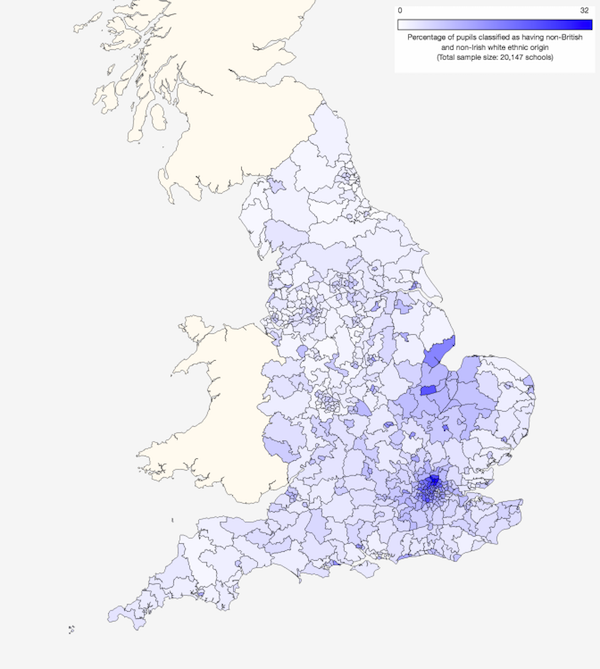
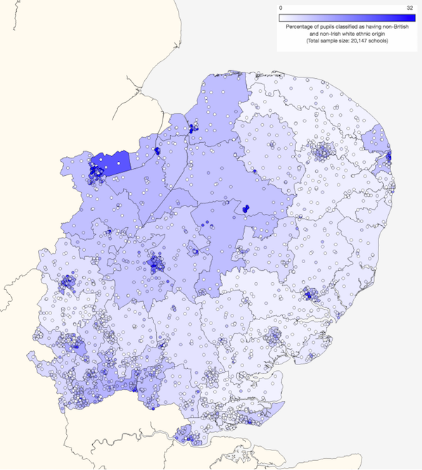
Across the country as a whole, the proportion of non-British white pupils is just under 5% and this varies only slightly between primary schools (4.9%) and secondary schools (4.2%), but as shown in Map 1 their distribution is very patchy, with a particular concentration in London (which contains 8 of the top 10 local authority areas and 9 of the top 10 parliamentary constituencies) as well as in Peterborough and nearby areas around The Wash. In some of these localities, the proportions of non-British white pupils can exceed 20% or even 30%. [Note added 30/4/18: These are mean values calculated using school-level data. Across the country as a whole, they tend to underestimate the proportions of ethnic minory pupils since these children are concentrated in larger urban schools; the actual proportion of pupils in England who are non-British white is more like 6% or 7%. Thank you to an eagle-eyed reader for bringing this to our attention.] (You can click on the map to go to a larger interactive version.)
Map 1: Proportions of non-British white pupils by parliamentary constituency (2015)
What is perhaps of even more interest, though, is the degree to which these numbers have changed over the last few years. This is shown in Map 2. Blue areas are those with the greatest increases in non-British white pupils since 2011 and red areas are those with the biggest declines over the same period2. (Again, click on the map to go to a larger interactive version.)
Map 2: Changes in proportions of non-British white pupils by parliamentary constituency (2011-2015)
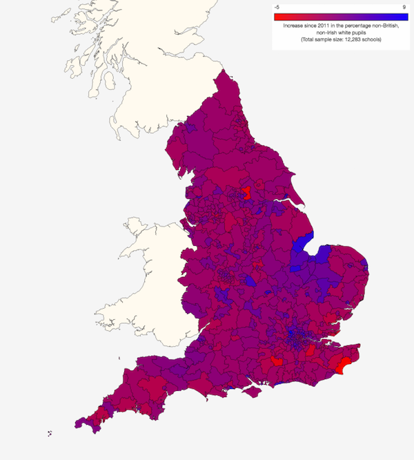
The overall national increase is modest, at 1.2%, but we see particularly high levels in north London (especially Harrow), Boston and Peterborough, as well as certain other localities, such as Bournemouth and Kingston-upon-Hull. These hotspots typically saw increases of 6 to 8 percentage points in the four years from 2011 to 2015 from starting levels of 10% to 20% – proportionately quite large changes in a short time. As reminder, these increases in non-British white pupils won't all have been EU immigrants, but it seems reasonable to assume that many of them were.
It is important to realise that just because an area has seen a large (or small) change in its mix of pupils, not all schools there will necessarily be affected similarly. By way of example, Map 3 zooms in to the East of England:
Map 3: Changes in proportions of non-British white pupils by parliamentary constituency (2011-2015)
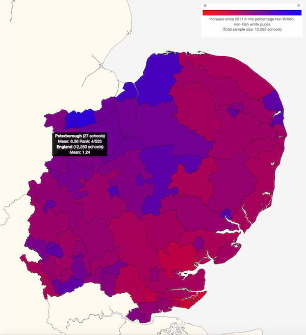
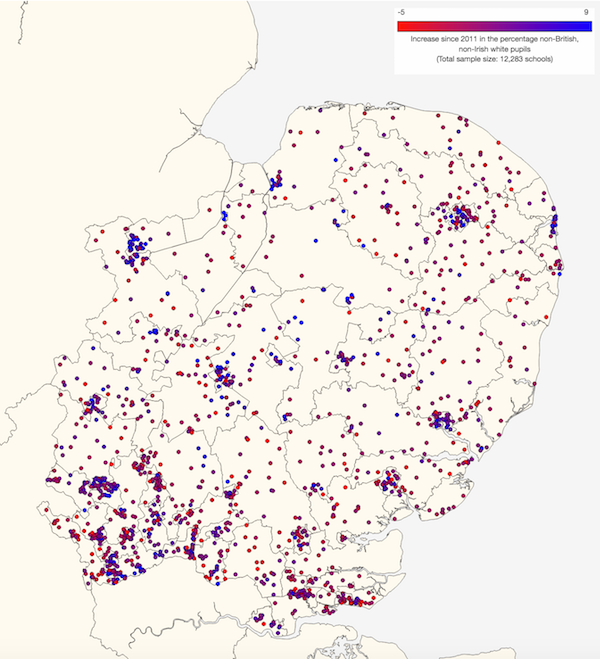
The hotspot in Peterborough is clear here, as is the general gradient of larger increases in the north and west, with smaller increases, or even reductions, in the south and east. When we look at a school level – see Map 4 – the same pattern is just about discernible, but we also see a more variegated picture, with many blue- and red-coloured schools in close proximity. So the effects are often hyper-local, reaching down even to the level of individual schools.
Map 4: Changes in proportions of non-British white pupils by school (2011-2015)
The same holds true when we look again at the absolute proportions of non-British white pupils that we saw in the Map 1 above. Map 5 shows this for the East of England:
Map 5: Proportions of non-British white pupils by parliamentary constituency (2015)
Again, even within areas that show higher or lower levels we see individual schools that buck the local trend, suggesting a degree of segregation at school level too. (For an outstanding theoretical explanation of how this sort of thing comes about, see Parable of the Polygons from the incomparable Vi Hart.) Also notice the very similar geographical gradient to the one we saw for recent increases, with higher levels (darker blue) in the north-west and mostly lower levels elsewhere. The pattern was very similar in 2011, too, which reinforces the commonsense notion that areas with existing immigrant populations tend to attract new immigrants, further accentuating their uneven distribution. This is shown more explicitly in Figure 1, below, which plots the increase in non-British white pupils between 2011 and 2015 (vertical axis) against the proportion of these pupils in 2011 (horizontal axis) for each local authority area in England. The size of each dot represents the number of school children in that area and its colour indicates the English region in which it is located.
Figure 1: Change in percentage of non-British white pupils against starting percentage (2011-2015)
One interesting aspect of Figure 1 is the fact that the proportions of non-British white pupils increased almost everywhere between 2011 and 2015, presumably reflecting the overall level of immigration during that period. In general, areas with higher proportions of non-British white pupils in 2011 saw larger increases in the proportions of those pupils by 2015. However, the overall correlation is not particularly strong, perhaps because the relationship isn't a simple linear one. Rather, there seems to be a threshold effect: all the of the areas that saw increases in non-British white pupils of more than 3 percentage points started off with proportions of at least 5% – but not all areas with high starting proportions saw large increases. This suggests that immigrants are attracted to areas where other immigrants already reside, but above a certain level other factors determine their choices. Note also the dominance of London and a few other southern locations.
Mother tongues
What effects have these changes had on the linguistic mix in schools? Figure 2 shows the relationship between the change in proportions of non-British white pupils (horizontal axis) and the change in proportions of pupils for whom English is an additional language (EAL; vertical axis) for each local authority in England3. Authorities in the top-right have seen the biggest rises in non-British white and EAL pupils, and those close to the diagonal line have seen similar increases in both measures, suggesting (though not proving) that much of the increase in EAL pupils has resulted from European immigration.
Note that EAL pupils are not necessarily poor at English, it just means that they learned another language first. Some will be adept multilingualists and others will struggle to communicate. This measure therefore tells us more about children's linguistic and cultural backgrounds than it does about their academic abilities (something we will look at below).
As with the proportions of non-British white pupils, the proportions of EAL pupils increased almost everywhere between 2011 and 2015. In general, the greater the increase in non-British white pupils, the greater the increase in EAL pupils. Some authority areas (such as Harrow) have seen relatively large recent rises in both non-British white pupils and EAL pupils, suggesting predominantly European immigration. Other areas (most notably the well-heeled London district of Kensington and Chelsea) have seen increases in non-British white pupils without corresponding increases in EAL, suggesting that they have become home to greater numbers of white Anglophone immigrants (eg, North Americans). Conversely, other areas (such as Hillingdon and Salford) have seen increases in EAL pupils but not in non-British white pupils, indicating that they have attracted immigrants of other nationalities and ethnicities.
Figure 2: Changes in percentages of non-British white pupils and pupils with English as an additional language (2011-2015)
Reinforcing the highly localised effects we saw in the maps above, these graphs also reveal particular hotspots by region. In the East of England they're in Peterborough and Luton, in the South West it's Bournemouth, and in the South East they're in Southampton and Slough. More modestly, in Yorkshire and The Humber there are mild hotspots in Kingston-upon-Hull, Doncaster and Wakefield; in the West Midlands there's one in Coventry; in the East Midlands there's one in Northamptonshire; in the North East there's one in Middlesbrough, and in the North West there's one in Blackpool. London, as in so many other ways, is a law unto itself and shows a wide variety of trends, reflecting the fact that it is a magnet for immigrants of all stripes, but Harrow stands out. Note also that London is the only region in the country with areas that show significant increases in non-British white pupils without corresponding increases in EAL, suggesting that the vast majority of English-speaking white immigrants end up in the capital.
For richer or poorer?
Another oft-voiced concern about a high rate of immigration is that it increases demand for government benefits, either because immigrants themselves receive such payments, or because they cause greater unemployment or under-employment among members of the native workforce, who might then become eligible for benefits. Figure 3 once again shows the change in proportions of non-British white pupils (horizontal axis), but this time compares it to the change in proportions of pupils for who are eligible for free school meals (vertical axis), which usually indicates a family in receipt of state benefits.
Figure 3: Changes in percentages of non-British white pupils and pupils eligible for free school meals (2011-2015)
Most areas, especially those in London, showed a reduction in free school meal eligibility over this period. Moreover, there's no positive correlation between increases in non-British white pupils and this particular measure of deprivation. Indeed, not a single local authority area that saw a large increase in non-British white pupils (3 percentage points or more) also saw an increase in eligibility for free school meals, though most of those areas are in the south of England so they don't necessarily tell us much about the country as a whole. This trend – or rather, absence of any trend – also holds for each region individually. In fact, some regions – Yorkshire and The Humber, the West Midlands and the South East – show hints of a negative correlation, which may indicate that immigrants have been attracted to areas that are doing well economically, but these apparent trends mostly depend on just one or two areas so could be mere statistical noise. (You can explore the other regions for yourself: click on the legend at the top of Figure 3 to turn specific regions on or off; double-click to view a region on its own.)
Affecting attainment
None of this may matter very much unless high levels of non-British white and EAL pupils materially affect school performance. To investigate this, we compared four groups of primary schools:
- 'All schools': All mainstream state primary schools in England (17,095 schools).
- 'Low white immigrant schools': All schools in group 1 that have 5% or less non-British white pupils and 5% or less EAL pupils (6,748 schools).
- 'High white immigrant schools': All schools in group 1 that have 25% or more non-British white pupils and 25% or more EAL pupils (273 schools).
- 'Similar low white immigrant schools': A subset of the schools in group 2 that are as similar as possible to those in group 3 except in terms of their proportions of non-British white and EAL pupils (253 schools).
This general approach will be familiar to anyone who's read our previous analyses on single-sex schools or academies, but for those who are new to this, or need a reminder, there's a more detailed description in Footnote 4.
Before judging any differences in academic attainment, we need to understand what kinds of pupils attend these schools – in order to make sure that we're comparing like with like. This data is shown in Figure 4. Unsurprisingly, the 'low WI' schools have far fewer EAL pupils than the 'high WI' schools. But they also have fewer pupils with high prior attainment (as measured at age 7) and more with low prior attainment. In addition, they have greater proportions of deprived pupils, as indicated by their eligibility for free school meals or the pupil premium. These are obviously essential factors to take into account when judging academic performance because, all other things being equal, less able and poorer pupils generally don't do as well at school as ones who are more able or more affluent. This is the reason we created the group of 'similar low WI' schools, which, while containing different proportions of EAL pupils, are very similar to the high WI schools in terms of their proportions of pupils with high or low prior attainment, as well as those who are eligible for free school meals and the pupil premium. Comparing these two groups of schools therefore allows us to control for such potentially confounding factors. We also controlled for special educational needs, though the differences here are modest across all groups of schools.
Figure 4: Pupil characteristics (2015*)
Figure 4 also shows differences in ethnic mix. The Low WI schools naturally have high proportions of British white pupils and low proportions of non-British white pupils. But they also have much lower proportions of South Asian and black pupils, so the differences in white children are not the only ones in terms of ethnicity. It is also worth mentioning that high WI schools tend to be larger, averaging almost 400 pupils compared to 240-250 pupils at Low WI schools.
With this in mind, we can compare the academic performance of each school type. Figure 5 shows the average proportions of pupils who reach Level 5, Level 4B and Level 4 (the national target) in Reading, Writing and Maths at age 11. For each level, high WI schools show lower attainment than low WI schools as a whole (hover over the bars to see exact values). However, when we control for other factors by comparing them with the group of similar low WI schools they actually come out ahead. The same pattern generally holds for different subsets of pupils, though with some variation: the biggest differences are seen for disadvantaged pupils and those who showed low attainment at Key Stage 1 (KS1; 7 years old), while the smallest differences are seen for non-disadvantaged pupils. You can use the drop-down menu in Figure 5 to explore various different pupil groups and levels.
Figure 5: Key Stage 2 attainment (2015)
Figure 5 only tells us whether pupils reached a given level across all three of Reading, Writing and Maths. Figure 6 breaks this information down into different subject areas, showing the mix of levels for each school type. This shows that high WI in fact slightly underperform similar low WI schools in Reading, but outperform them in Grammar, Punctuation and Spelling (GPS), teacher-assessed Writing and (ever so slightly) in Maths. In teacher-assessed English and Science, the high WI schools perform very similarly to the similar low WI schools, though with slightly higher proportions of both under- and over-performing pupils, and fewer in the middle of the attainment range.
Figure 6: Key Stage 2 results (2015)
The final attainment metric we will look at is the Key Stage 2 (KS2) value-added score, shown in Figure 7. This measures the over- or under-performance of each pupil based on their attainment at the end of KS1 (ie, at 7 years old). It helps to further correct for any differences in attainment that might exist before pupils enter KS2, but note that it is a relative measure, so if one school goes up then another school must necessarily go down. Values for each school are simply the averages for all relevant pupils in the school. In Figure 7, zero represents the national average, with positive numbers indicating above-average attainment and negative numbers indicating below-average attainment. Variations of just a point or two are very significant: a score of -2.4 or below would have put a school in the bottom 10% in the country in 2015, and a score of +2.6 or above would have put it in the top 10%.
High WI schools show postive value-added scores overall, but also in every sub-category: pupils with high, medium and low KS1 attainment, as well as both disadvantaged and non-disadvantaged pupils. The same is also true in each of the principal subject areas: Reading, Writing and Maths. However, this is potentially misleading because, as we saw in Figure 4, high WI schools contain relatively large proportions of pupils who showed low attainment at KS1. In general, pupils with low prior attainment show higher value-added scores because they have more room to progress (even if doing so isn't necessarily easy). So it is more meaningful to compare the high WI schools with similar low WI schools, which have comparable proportions of low- and high-attaining pupils. Here, too, the high WI schools win on every count (use the drop-down menu in Figure 7 to explore the various measures).
Figure 7: Relative value-added score (2015)
This may seem surprising. Why would schools with large numbers of foreign kids, many of whom learned other languages before picking up English, do better academically than similar schools catering mainly for native British pupils? There at least two likely explanations, possibly related to each other.
The first is that EAL pupils often seem to do better than non-EAL pupils because they come from immigrant communities that, while not necessarily affluent or influential, take education very seriously. Contrary to popular perception, therefore, a high proportion of EAL pupils is generally seen by educationalists as a positive indicator of likely academic attainment. I haven't seen this claim being made with respect to white EAL pupils specifically, but it seems plausible that it could apply to them as well as other ethnicities. Recall also that a high proportion of non-British white pupils tends to correlate with other differences in pupil ethnicity, so it is more correct to think of this analysis as comparing schools with high and low ethnic diversity rather than simply high and low proportions of non-British white pupils, even though for this study schools were selected on the basis of the latter ethnic criterion alone (see Figure 4, above, and also Figure 8, below).
A second factor is what is sometimes referred to as the 'London effect'. Of the 273 high WI schools we've studied here, no less than 177 (65%) are in London. It is well known in education circles that London's schools are unusually effective (see for example, this coverage of SchoolDash data on the topic). This was emphatically not the case 10 or 12 years ago, and the reasons for London's educational transformation are much debated, with some people holding it up as a role model for cities elsewhere and others claiming it to be a one-off that can't possibly be replicated. The truth is almost certainly that a range of factors – political, economic, demographic and cultural – have contributed to the recent success of London's schools, and while the combination may well be unique it's hard to believe that none of them could apply elsewhere.
Still, the question remains: how much of the relatively good performance of high WI schools is just another way of saying that London's schools are unusually good?
Laudable London
Over the next few figures we will look at the same attainment measures, but this time we'll split high WI schools into two groups: those in London and those outside. We'll compare these with each other and also with low WI schools outside London. (There's no separate group of low WI schools in London because such schools are almost non-existent in the capital.)
As before, we first need to check that we're comparing like with like. By splitting apart schools inside and outside London we may have skewed our samples in terms of pupil characteristics such as prior attainment or deprivation. This information is shown in Figure 8.
Figure 8: Pupil characteristics (2015*)
On average, high WI schools in London have even more EAL pupils than those outside London. They also have greater proportions of pupils with high or medium KS1 attainment and correspondingly smaller proportions of those with low KS1 attainment. The proportions of pupils who are eligible for free school meals and the pupil premium are better aligned, though both are slightly lower in London, as is the proportion of pupils with special educational needs (SEN). On this basis, we would expect high WI schools in London to do slightly better than those outside simply because of their pupil intake. Importantly however, the pupil profiles of high WI schools outside London are well matched with those of similar low WI schools outside London, so these two groups can be fairly compared without making any further allowances for different intakes.
There are, of course, clear differences in the ethnic profiles of these three groups of schools. British white pupils are more numerous in low WI schools than in high WI schools, and lowest of all among high WI schools in London. Conversely, black pupils are least numerous in low WI schools and most numerous in high WI in London, with high WI should outside London coming somewhere in between. Non-British white and Asian pupils are more common in high WI schools than in low WI schools, but their proportions are very similar between high WI schools inside and outside London. The upshot is that, as we have already seen, by selecting schools with higher proportions of non-British white pupils, we are to some extent selecting those with higher proportions of Asian and black pupils too.
Figure 9 shows the same attainment measures that we previously saw in Figure 5, but this time using our new division of schools. The sample sizes here are rather small, so we need to take care not to over-interpret the results, but it is clear that high WI schools in London comfortably outperform those in other parts of the country at Level 5, Level 4B and Level 4. In my view this gap is unlikely to be accounted for by the relatively small differences in intake that we saw in Figure 8. Even more tellingly, high WI schools outside London don't seem to do quite as well as similar low WI schools outside London.
Figure 9: Key Stage 2 attainment (2015)
So in terms of absolute levels of attainment, high WI schools in London do better than similar low WI schools elsewhere, but high WI schools outside London do a bit worse than comparable low WI schools.
Figure 10 shows the same comparison for the KS2 value-added measure, which quantifies pupil progress between the ages of 7 and 11. Again, we see London schools doing better overall. But on this measure High and low WI schools outside London do just about as well as each other. If we drill into the data a bit further, we see that high WI schools do relatively poorly when it comes to previously high-attaining pupils and Reading, but they do well with low-attaining pupils and in Writing.
Figure 10: Relative value-added score (2015)
So the message with respect to primary schools is that those with high proportions of non-British white and EAL pupils generally do better than those with lower proportions. But this is very largely a London-specific effect. If you believe (as some do) that London's educational strength comes in part from its ethnic and linguistic diversity then you could reasonably conclude that having a lot of white immigrant children at a school is likely to help rather than hinder its academic progress. But beyond London the picture is more ambiguous, with the results ranging from no effect to small negative effects. Does this difference arise because London is better at educating such children or because the kinds of immigrant families that arrive in the capital are different from those who settle elsewhere? Both causes are plausible, and the data don't distinguish between them, but in my view both are likely to apply to some degree.
We have also looked at secondary school performance but I won't present those results here because (a) the differences in ethnic mix between secondary schools are much less marked than those between primary schools, (b) the overall story is largely the same, and (c) this post is already plenty long enough. :)
All in all
To summarise what we've learned:
- The average national increase in the proportion of non-British white (NBW) pupils between 2011 and 2015 was just over 1 percentage point across all schools, but was disproportionately concentrated in particular areas, especially ones where such pupils were already relatively common. Certain parts of London and a few other specific areas, mainly in southern England, showed the largest increases.
- There is little evidence that schools with high proportions of NBW and EAL pupils do much worse than those serving predominantly native British children, and some evidence that they can do much better, at least in London.
- The effects of EU immigration in terms of both numbers and their effects on academic attainment therefore appear very local, with most areas largely unaffected, a few areas heavily affected and London positively thriving, at least in terms of academic outcomes.
Footnotes: